Case Study
Active Responder
An enterprise platform that replaced paper-based SOPs with a real-time, collaborative execution environment used by GSOC teams at Johnson Controls and Microsoft to run bomb threats, executive duress and life-safety incidents.
- Client
- Johnson Controls · Microsoft GSOC
- Role
- Lead UX Designer
- Duration
- 2019 – 2022
- Team
- Sole designer, 10 devs, 2 QA, 1 PM
- Platform
- Enterprise Web · Safety-critical SaaS
The problem
When a fire alarm triggered in an office, a security monitor had to find the right SOP, the right building, the right version, the right escalation path, in a physical paper file, while the clock was running. Paper procedures couldn't be updated in real time, shared across remote operators, or audited reliably. A missed step in a duress or bomb-threat SOP isn't a workflow inconvenience; it's a physical safety risk. That reality shaped every decision: clarity over cleverness, explicit over assumed, auditable over convenient.
Approach
- 01Spent time on the floor across multiple SOC offices, with interviews, multi-day shadowing, and watching the moments where paper broke down.
- 02Designed for two users on the same screen: analysts executing tasks and supervisors overseeing progress, without compromising either.
- 03Shipped three production phases over two years on a 2 to 3 week cadence, each one driven by what operators surfaced in the last.
- 04Prototyped the hardest flows end-to-end in Axure to lock alignment with PM and engineering before any code was written.
- 05Wrote every Jira ticket in a consistent what / why / impact / minimum / UX format, which the team adopted as standard by Phase 3.
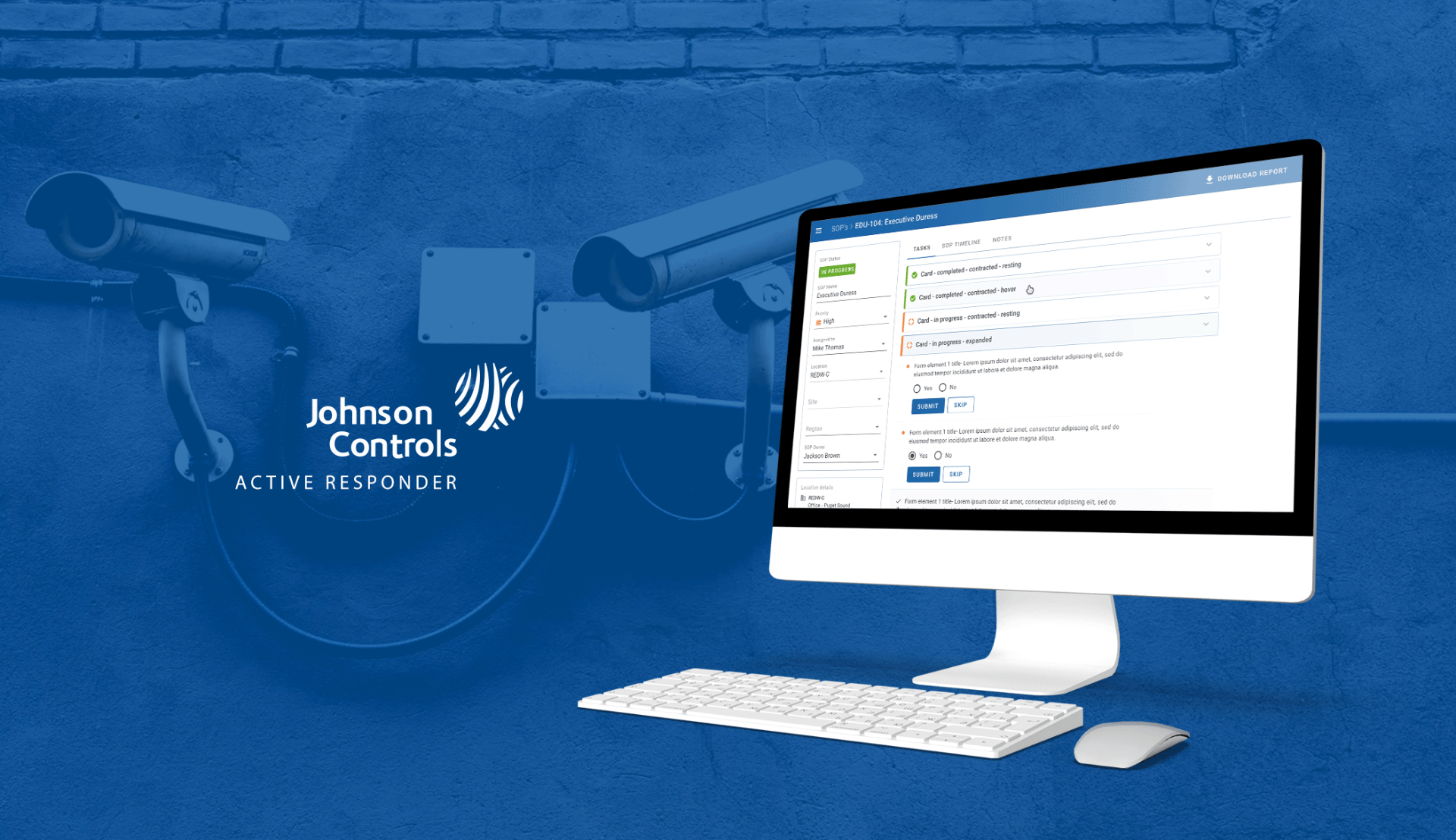
The SOP page at a glance
Before walking through how the product evolved, this is the surface itself: SOP attributes on the left, the task feed in the centre, location and template metadata beneath. Every decision in the phases below maps back to a region of this page, so it's worth orienting once.
Phase 1, Foundation
Get the core execution loop right before adding anything else. Each task lived in a card that collapsed to a single status line so operators scanning 20+ tasks could orient instantly, and expanded to reveal the form with Submit and Skip. Every state, pending, in-progress, restricted, completed, was readable without interaction. The sidebar held SOP attributes; the right panel held the task feed. Intentionally minimal.
Phase 2, Context
Walkthroughs after launch showed analysts leaving the app mid-incident to look up location details and contacts elsewhere, breaking focus at the worst possible moment. I brought a location panel, live points of contact with one-tap call / Teams / email, and SOP template metadata directly into the page. The PDF export shipped here too, answering a long-standing compliance ask from supervisors.
Phase 3, Collaboration
As the platform scaled to multi-region use, the two-column layout couldn't show how work was divided across a distributed team. I moved to a three-column model, SOP metadata, task columns grouped by workflow stage, and a review-and-close column, that mirrored how teams actually split responsibility during a live incident. A check-updates badge flagged when a remote colleague had acted on a shared task, cutting duplicate and conflicting submissions.
Nested SOP contracts
The same template often ran across multiple locations, with input/output variables, instance prefixes and process ownership defined per instance. Technically the most complex design challenge on the project. I prototyped the full configuration flow in Axure across five progressive states and used it to align the PM and engineering lead before any build, saving weeks of rework.
Structured tickets as design artefact
Every feature ticket had the same skeleton: what is it, why is it needed, impact of not having it, minimum required, nice to have, UX considerations. Developers had enough context to make good decisions without me in every standup, design intent survived a fast release cadence, and by Phase 3 the format was team practice.
A shared design system across JCI
While working on some previous products, we faced challenges regarding consistency and repeated design and dev efforts by creating multiple copies of design elements. So, we decided to make a universal design library for all the JCI products. Components, app bars, modals, tokens and patterns were defined once and consumed across teams, which cut review cycles and gave every JCI product a recognisable, accessible baseline.
The hardest part
Safety-critical design isn't about interaction complexity, it's about the cost of getting it wrong. A poorly labelled button in a standard product causes frustration; the same mistake in a live bomb-threat response causes someone to hesitate or act on the wrong information. I stopped asking 'is this understandable?' and started asking 'is this unambiguous to someone already stressed, under time pressure, managing three things at once?' Different question, different answers.